The Brief
In a collaborative session with the university president, we explored the holiday season’s core and her reflections on it. Drawing inspiration from our dialogue, I conceived a distinctive holiday card that would encapsulate the university’s ethos and kindle campus reminiscence. I selected quintessential campus landmarks resonating with the president’s fond memories and meticulously rendered them with graphic design finesse. My approach was to infuse the card with the university’s signature essence and the festive vibrancy that the holiday season brings to the campus life. The outcome was a card that not only showcased graphic design artistry but also resonated emotionally, forging a profound connection with its recipients and authentically mirroring the university’s spirit.
Results
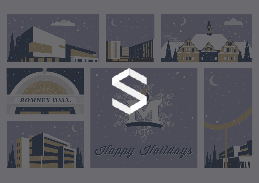
The design of the holiday card for Montana State University (MSU) became a tribute to both the institution’s storied heritage and the transformative impact of President Cruzado. In the visual narrative, I strategically positioned MSU’s most iconic structures – including the cutting-edge Norm Asbjornson Hall, the contemporary New Residence Hall, the historic Montana Hall, the storied Romney Hall, the innovative Jake Jabs Hall, and the iconic ‘M’ Trail’s endpoint, known colloquially as ‘The Noodle.’ Barnard Hall was also artfully integrated into the scene, providing a harmonious balance to the composition.
During the meticulous design process, I was dedicated to authentically representing each building’s architectural integrity, which involved a deep dive into architectural graphic design techniques. To infuse a sense of campus pride and a playful element, I cleverly embedded the letter ‘M’ within the design’s snowflakes – a nod to MSU’s spirit. The joy discovered in illustrating these structures was profound and the response to the finished piece was overwhelmingly positive, affirming the power of thoughtful graphic design to encapsulate and celebrate an institution’s identity.
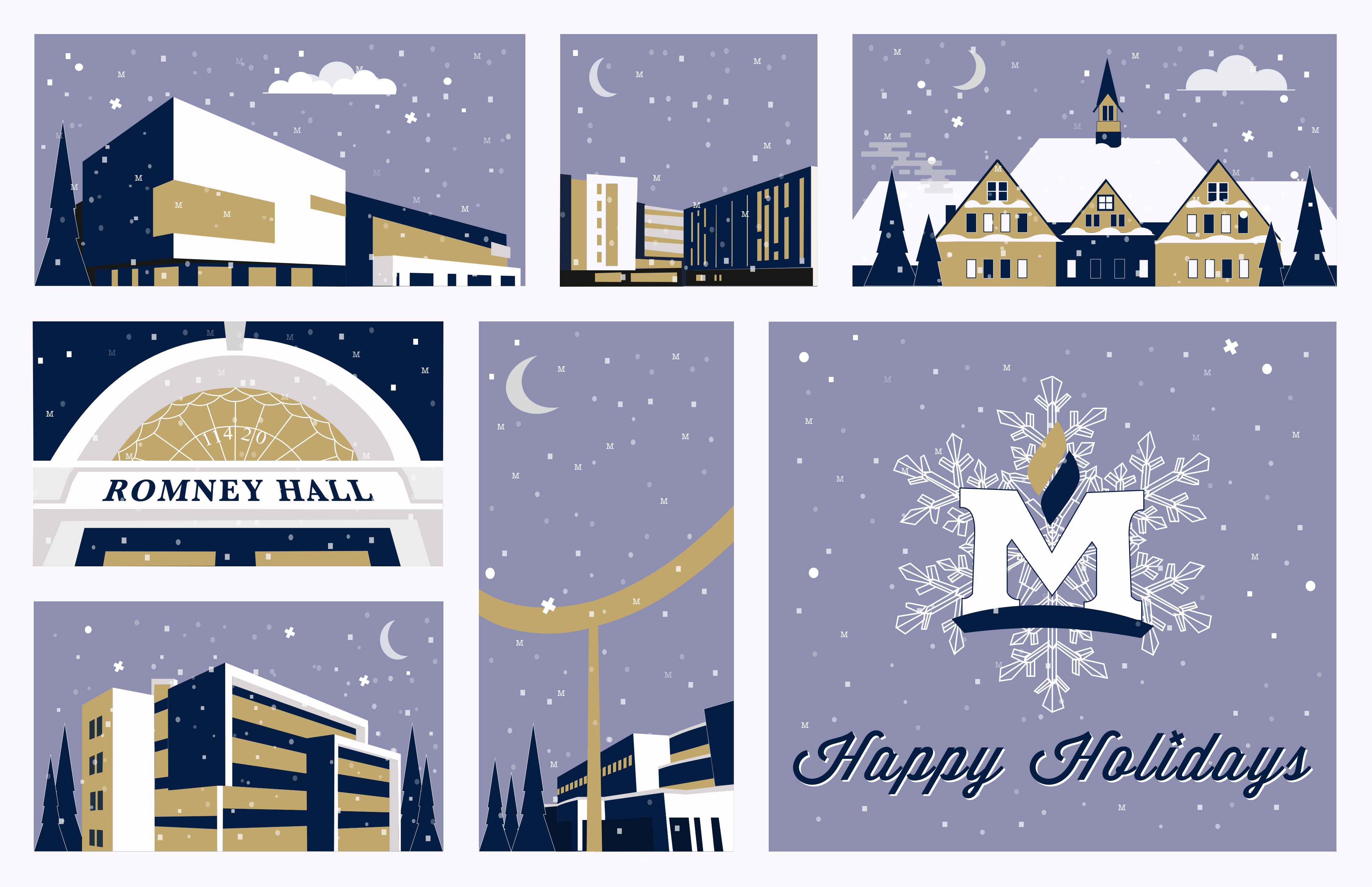
Primary Design
The primary card design for Montana State University’s holiday card elegantly blends a modern graphic style with traditional holiday elements. The color palette is a sophisticated combination of navy and varying shades of gold and cream, conveying a wintry nighttime scene that’s both festive and reflective of the university’s colors. This choice of a cool-toned backdrop with warm accents creates a striking contrast, suggesting the cold of winter warmed by the celebratory spirit of the holidays.
Each panel features a simplified, stylized illustration of iconic campus buildings, employing a flat design aesthetic that is both clean and contemporary. This minimalist approach focuses on the geometric shapes that compose the architecture, giving the card a sleek and polished look. The buildings are set against a starry sky with gentle snowfall, further emphasizing the holiday theme.
The snowflakes, subtly detailed with the university’s “M” logo, are a clever touch that personalizes the design, tying the university’s identity to the universal symbol of winter. This integration of branding into the visual elements showcases a thoughtful design strategy aimed at reinforcing school pride subtly.
The typography is classic and unobtrusive, using a serif font for “Happy Holidays” that complements the more modern sans-serif font used to label the buildings. The serif font for the holiday greeting adds a touch of elegance and formality, while the sans-serif maintains the overall contemporary feel of the design.
Overall, the design decisions—from the color scheme and illustration style to the typography and branding elements—work cohesively to produce a holiday card that is both a celebration of the university’s heritage and an embodiment of its forward-looking ethos.
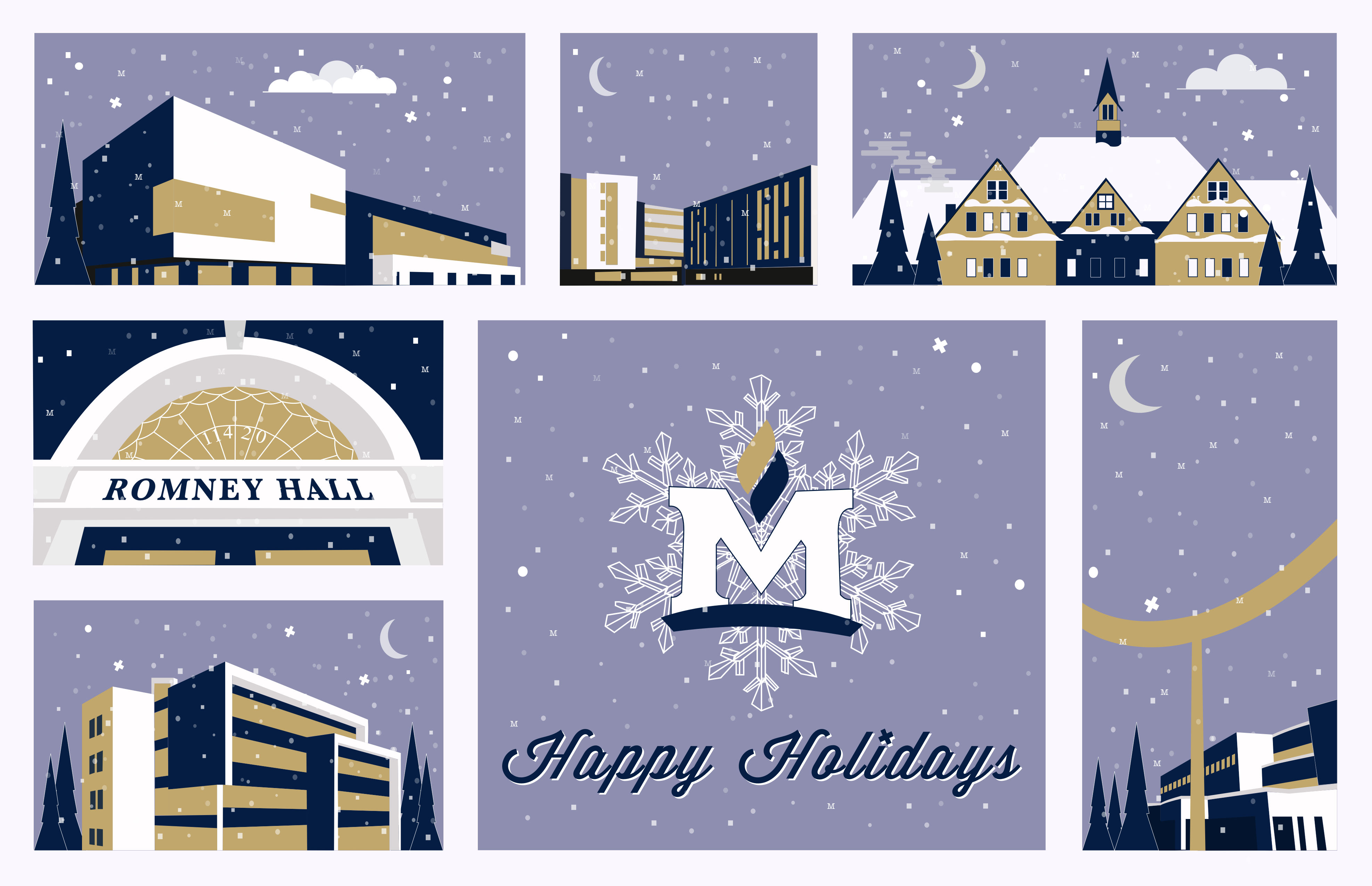
Alternate Design
This alternative layout for Montana State University’s holiday card maintains the elegant graphic style of the primary design but presents a reimagined composition that offers a fresh perspective. The color palette remains consistent with the original, featuring navy and shades of gold and cream, which provides a sense of continuity and brand consistency.
In this version, the buildings are rearranged, potentially to give each landmark its own moment to shine within the card’s sequence. The design continues to employ a flat aesthetic, emphasizing clean lines and geometric forms that give prominence to the architectural features of each structure.
The “M” integrated snowflakes are present as well, reinforcing the university’s branding in a subtle and artistic manner. The placement of these elements may have been adjusted to create a balanced visual flow across the card’s new layout.
Typography in this alternative design continues to play a crucial role. It appears that the same serif font for “Happy Holidays” has been used, retaining the elegance and traditional holiday feel. The sans-serif font for the building labels likely remains unchanged, upholding the modern and accessible vibe of the card.
Overall, the adjustments in layout are made with a clear understanding of visual hierarchy and composition, ensuring that each element complements the others while still standing out on its own. The design decisions in this alternative card demonstrate a thoughtful approach to graphic design, where every change is made to enhance the overall aesthetic and emotional impact of the card.
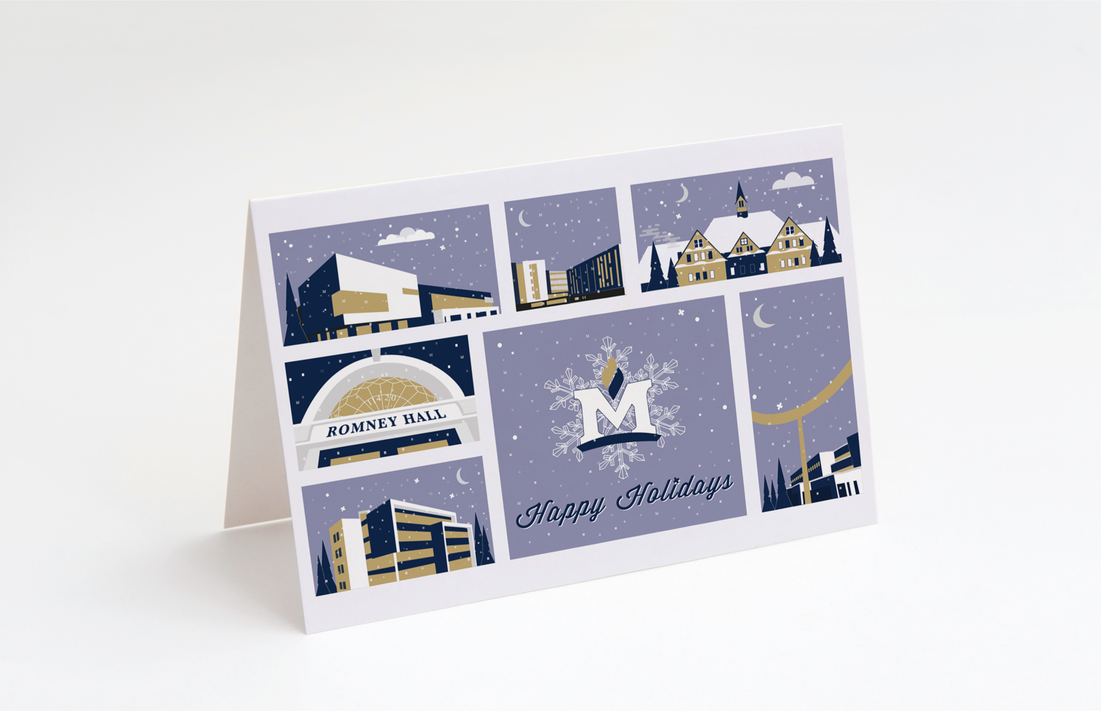
Card Mockup
The alternative card design, now shown as a mockup to simulate its real-world application, presents the primary design elements in a tangible context, enhancing the viewer’s understanding of the final product. This mockup demonstrates how the design translates into a physical holiday card.
In this layout, the illustrations of the campus landmarks and the “Happy Holidays” message are arranged to maximize visual impact when the card is displayed. The strategic placement of each element ensures that the design remains balanced and aesthetically pleasing when folded.
The color scheme of navy and gold carries over from the digital version, retaining its sophisticated and festive feel. The gold tones of the landmarks stand out against the deep blue background, making the card feel premium and aligned with the university’s branding.
The typography on the mockup is consistent with previous iterations, showcasing the chosen fonts in their final printed form. The serif font used for the holiday greeting adds an element of classic elegance, while the sans-serif for building names maintains readability and modernity.
This mockup is a crucial step in the design process as it provides a preview of the card’s physical appearance, allowing for any necessary adjustments before the final print run. It’s a practical demonstration of the card’s appeal as a keepsake that recipients may display and cherish during the holiday season. The design decisions, from color to typography to layout, all come together to create a cohesive and engaging piece that reflects both the holiday spirit and the distinctive identity of Montana State University.
