SoundCloud UX Research
Research86% expected it. 8% could do it.
Five of us ran SoundCloud's desktop site through a full research pipeline for a grad methods course - a heuristic audit, competitive analysis, tree testing, moderated usability testing, and a validating A/B test. The goal wasn't a list of gripes. It was proof, before we recommended anything, that our fixes actually worked.
Quick scan
- The headline finding: 86% of people expected to create a playlist from the Playlists page. Only 8% actually could - the real path is three clicks deep in a song's menu.
- Five-person grad research methods course project, no affiliation with SoundCloud - I worked across all 5 phases: heuristic audit, competitive analysis, tree test, moderated usability test, A/B test.
- We didn't stop at diagnosis. We designed a fix and proved it in an 85-person A/B test: +45% task success, more than 2x faster.
- Same pattern with volume control - just making an existing slider visible cut misclicks 26% and time nearly in half.
Team
Ariana Davies, Shawn Farnum, Nic Loyola, Carly Pratt, Sage Young
Role
UX Researcher - contributed across all 5 phases
Timeline
12 weeks - Winter Quarter 2026 · UC Irvine, HCI & Design
Status
Completed - Final Report Delivered
Overview
We picked SoundCloud for a research methods course at UC Irvine - no connection to the company. Instead of stopping at "this feels clunky," we ran five research phases in sequence, each one sharpening what the last one found, so every recommendation was backed by evidence, not opinion.
86%
expected to create a playlist from the Playlists page
8%
actually could - the real path is 3 clicks deep in a song menu
+45%
task success after moving that path to where people looked
How we got there
Heuristic analysis
Every core flow - browsing, search, library, playlists, comments - checked against Nielsen's 10 usability heuristics. 17 findings, tagged Major, Moderate, or Minor.
Competitive analysis
Benchmarked Spotify and Apple Music directly, plus Bandcamp, YouTube, and TikTok for discovery and artist connection.
Tree testing
51 people navigated a text-only version of the site - labels and hierarchy only - to isolate whether the structure matched what people expected before design entered the picture.
Moderated usability testing
6 people worked real tasks on the live site, thinking aloud - the round that told us why something broke, not just that it did.
Quantitative A/B test
85 people split between the live site and our redesigned prototype, timed and scored on the same four tasks - proof the fixes actually worked.
The clearest signal: playlists
One tree-test result stood out immediately: 86% of people expected to create a playlist straight from the Playlists page. Only 8% could - the real path is three clicks deep, inside the ellipsis menu on one specific song.
That's not something a tooltip fixes. People walked in with a completely reasonable model of how the product should work, and the product didn't offer it.
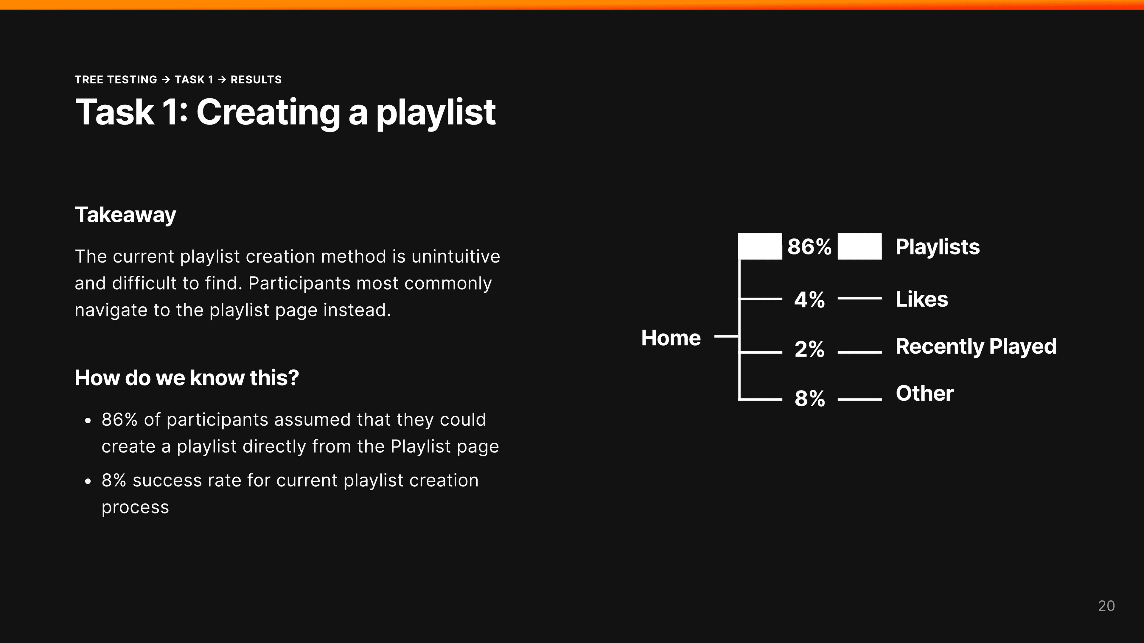
Tree test, Task 1: creating a playlist. 86% expected a path from the Playlists page itself; only 8% found the real one.
There's nowhere obvious here for me to actually add a playlist.
Moderated usability test participant, mid-task
A/B test results (85 participants)
We ran the same four tasks against the live site and our redesigned prototype.
| Task | Success | Time | Ease |
|---|---|---|---|
| Find & listen to an album | N/A | 74s → 58s | 22% faster |
| Adjust the volume | N/A | 36s → 19s | 26% fewer misclicks |
| Comment on a track | 49% → 63% confidence | N/A | No lift in perceived engagement |
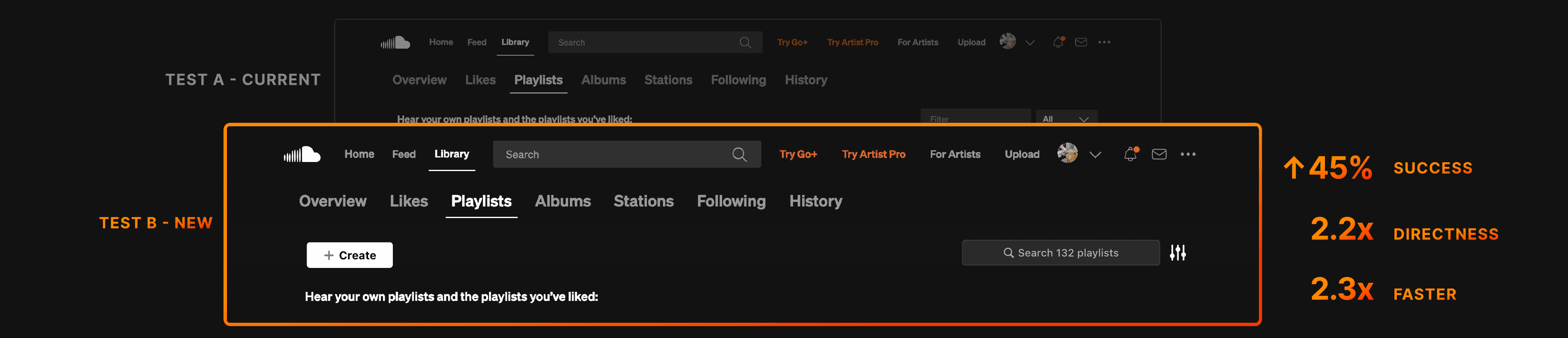
| Create a playlist | +45% success | 2.3x faster | 2.2x more direct |
Playlist creation and volume control drove the clearest gains - both just needed something that already existed to be more visible. The comment fix worked exactly as designed but didn't move engagement, confirming it was the right one to not over-invest in.
What we prioritized, and why
17 flagged issues, time to prototype and test two. Here's how we chose.
Constraint
Comments, following, and the player bar were all flagged as confusing alongside playlist creation - we couldn't test everything in one quarter.
Decision
We prioritized playlist creation and volume control for the A/B test and treated the rest as lower-confidence fixes for later.
Resolution
The data backed the call: those two drove the biggest, clearest wins, while a smaller comment fix worked exactly as designed but didn't move how engaged people felt.
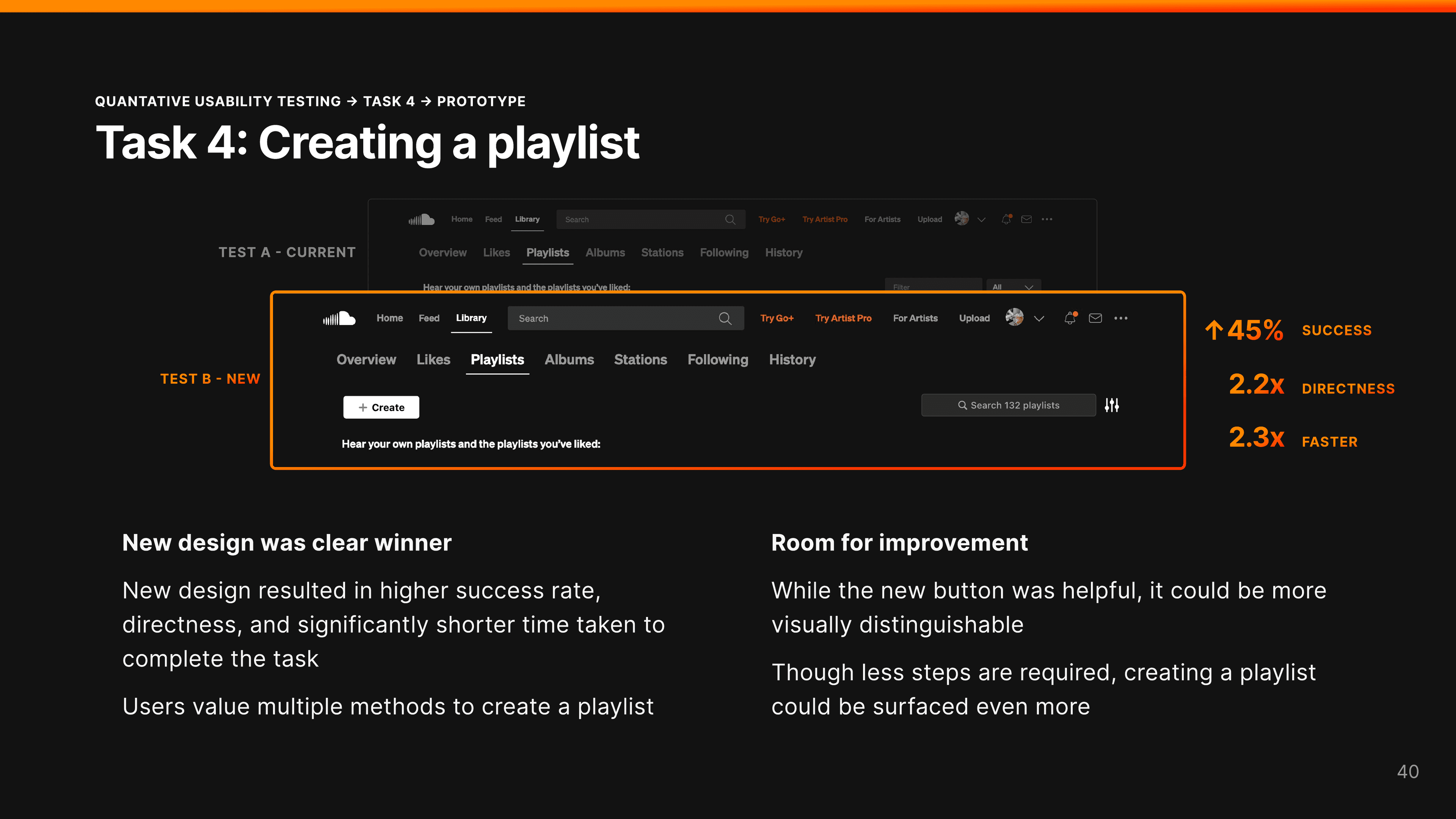
A single Create button added to the Playlists tab lifted task success 45% and cut completion time to under half.
What we'd fix next
Ranked by impact against effort to ship:
- A real Create Playlist button on the Playlists tab - not three clicks deep in a song's menu.
- A redesigned player bar with the volume slider visible by default, not hidden behind a hover.
- Search ranked by relevance and content type, not just literal title matches.
What this was actually about
The two biggest wins didn't require building anything new - the ability to make a playlist and the volume slider both already existed. We just moved them to where people were actually looking.
Most "usability problems" are really a gap between what's in someone's head and what's on the screen - and the only way to know a fix closes that gap is timing a stranger doing the task, not deciding for yourself that it feels better.